What does sustainability look like? - March 2024 Edition
Written by
Jordan Stokes, Caroline Leung, Stephanie Lau, Alanna Roy Bentley, Jaymee Kim, and Alex Shute - Sustainability Transformation
Welcome to the March instalment of ‘What Does Sustainability Look Like’ - the Edge Impact creative team’s analysis of their favourite purpose-led design, sustainable brands and impactful ideas from the world of sustainability creative.
This month, we explored the full spectrum of sustainable design, from a complex digital carbon calculator to a printing company with their own windmill.
All commentary and opinions are our own and come from Jord, Caz, Steph, Alanna, Jaymee and Alex.
Jaymee - Printing by Wind
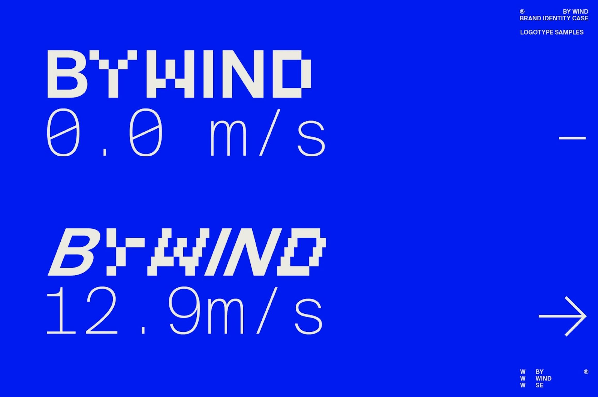
Last year, two of Sweden’s most reputable printing companies (öteborgstryckeriet and DanagårdLitho) merged together to create By Wind, a leading printing company that not only prides themselves of quality, specialisation but also sustainability.
By Wind takes their printing process to the next level, with everything from world-class art, large format to commercial printing produced using their own windmill power.
Printed design will always have a special place in my heart, and in a world that is very quickly moving towards design that caters to the digital space. It is very cool to see printing companies move towards a direction that allows alternative, more sustainable printing options to retain the tactility of art and design. Allowing it to be out in the world whilst reducing the negative impacts that traditional print has on the world.
If that weren’t enough, their branding really ties everything together like a nice little bow. With the clever brand and logomark that conveys the wind force and power generated at the printing facility in real-time. This kind of transparency exudes confidence in their practices and I can only see why By Wind is such a success in the world.
Caz - Thank you by Marx
I've always admired the Thank you brand since its inception. While their original aesthetic wasn't necessarily my personal style, it was their dedication to making a positive impact and their mission to eradicate global poverty that earned my loyalty over the years.
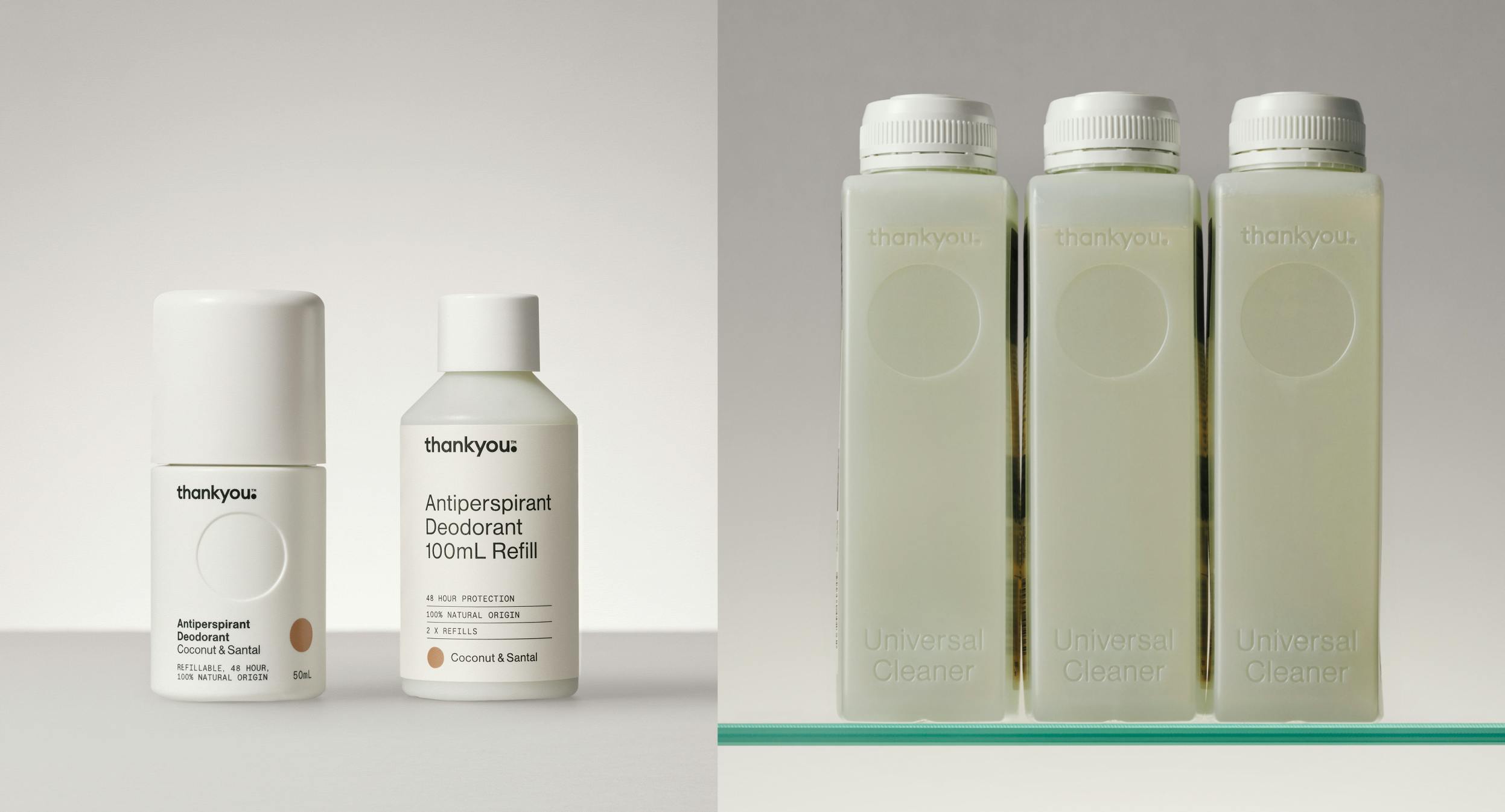
Recently, Thank you rebrand and relaunched thanks to one of my favourite agencies, Marx. The result is a stunning and timeless product range, offering a refill system that embodies genuine sustainability at its core.
The meticulous attention to detail is evident in every aspect of the product range. Beyond the focus on using 100% recycled materials, the emphasis on end-of-life recyclability and the reduction of packaging waste through the refill system is truly noteworthy. Simple design elements, such as debossed product names on the side of the bottle, rather than printed stickers that creates a simple identification system when stacked in your cupboard, it is a breath of fresh air to what we would normally expect on a supermarket shelf.
Thank you’s redesign demonstrates a refreshing departure from conventional FMCG packaging. This is a great example of how design and sustainability can coexist harmoniously to create products accessible to all. I am hopeful that Thank you's approach sets a precedent for future products in the market, where design and sustainability are prioritised in equal measure.
Jord - Sumday
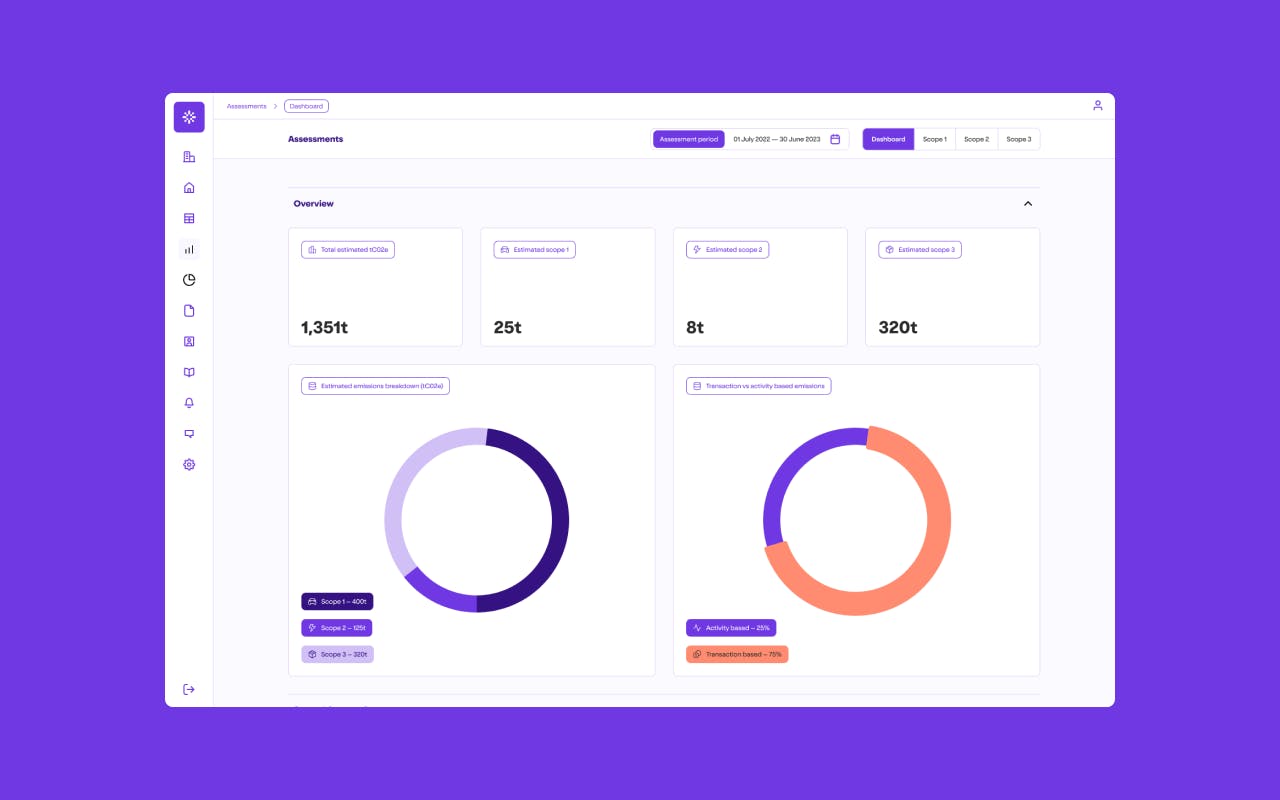
The smashing together of sustainability and digital products has been high on our agenda just recently, especially in the carbon accounting space as we’re starting to help lots of organisations on their mandatory disclosure journey. As part of this work, we’ve been pretty excited to come across Sumday.
Sumday are a Tassie based accounting software business that are built for a new era of carbon accounting, simplifying the reporting process in line with global standards and empowering businesses through beautiful products, education and support.
I love that Sumday has positioned itself away from the typical ‘sustainable’ tech crowd, through a clean visual identity that uses just 2 colours but that packs loads of personality through it’s use of illustration and playful copywriting.
Simplicity in the logo, icon and typography help create a solid brand foundation that is then added to with the illustration, pattens and limited photography.
The illustration elements of the brand are built from a modular illustration by Joseph Carrington, which taken inspiration from the ‘human / tech / illustration’ trend but doesn’t feel tired or cliche here. It also seems to be flexible enough to be easily pulled apart and used in lots of different ways across the supporting collateral and marketing.
The brand tone of voice and copywriting (mainly on the website) feels really down to earth and is playful in places, even down to the way they introduce the team and their investors. The down-to-earth approach to their content is also really successful here, especially because of the complexity of the subject matter and the mind-bending use of acronyms and jargon that this area of sustainability seems to insist on, reading the Sumday website feels like a breath of fresh air.
The core identity allows Sumday to feel at home in both the established big tech and the sustainability worlds and by bringing the beautifully designed products that we are used to seeing, but that have largely evaded sustainability to life they are a bit of a shining light in the quest to make sustainability a part of every businesses’ agenda.
As simple as it may sound, but just by bringing well designed dashboards, data visualisation and beautifully considered UX into the sustainability / tech space is a huge leap in the right direction. Something we’ve definitely tried to carry through in our work to bring Edge Impact’s own climate tech products to market.
I can’t wait to see more of this level of work in the sustainability space, hopefully we get to be a part of some of it too.
Steph - Unyoked
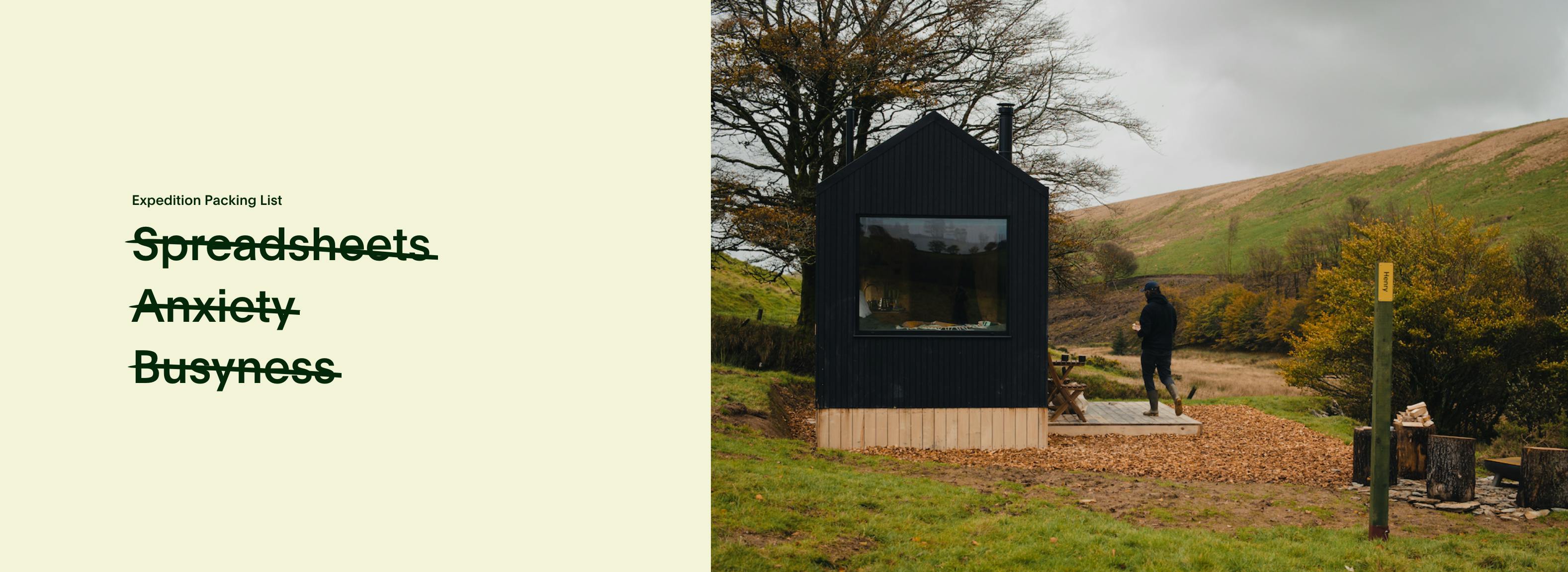
If you are experiencing symptoms like ‘acute overflowing inbox’ or ‘chronic decision fatigue’, Unyoked claims that their nature prescriptions could be just what the doctor ordered.
Unyoked is a home-grown startup offering nature-based stays and since launching in 2017, has been leading the off-grid movement that has seen solar-powered, minimal impact cabins popping up in remote locations across Australia, New Zealand, United Kingdom and more recently, Europe. Picture a cosy room with a gas stove, compact fridge, composting toilet, shower, bedding and a wood burner - simple luxuries that create minimal distractions so you can slow down and be fully immersed in nature for at least two days.
While the notion of going off-the-grid as an antidote to the demands of modern life isn’t new, I love how Unyoked creatively positions the benefits of their experiences (i.e. less stress, better sleep, boosted creativity and more) without it feeling like a sales pitch at all. The result is a brand experience that feels unique, uplifting and like you’re having a conversation with a friend.
From the ‘prescription’ gift card and the newsletters that actually spark joy to the thought-provoking editorial content and partnerships with a bunch of very cool people (hello Matthew McConaughey!), their brand is consistently and effortlessly conveyed across every single touchpoint to make you feel a certain way - sounds simple but hard to do.
I think Unyoked is a shining example of how a brand’s tone of voice isn’t just documented on a page in a company’s brand guidelines, signed off and forgotten. In practice, it can truly breathe life, authenticity and intention into what you have to say to your audiences in order to create a lasting impression - no matter if you are getting across more practical information or sharing a good story.
When it comes to communications in the sustainability space, this brand-led approach can make all the difference in how we can influence the way audiences think, feel and act. At Edge, we always start by looking at the brand - including its mission, values and how it’s represented visually and through words - to help organisations embed sustainability from the inside-out.
Alex - The Wool Pot by Seachange
This Summer, I embraced my green thumb and grew basil plants for my friends and family. I did so using pots from Bunnings, and although i’ll reuse these, I’m still ashamed to have purchased 25 of the billions of plastic pots that are produced globally each year (and take 450 years to decompose in landfill). The garden industry’s dirty little secret.
If only i’d known about The Wool Pot - a revolutionary biodegradable plant pot, made from 100% recycled New Zealand wool. It breaks down within weeks and even adds nutrients into the soil.
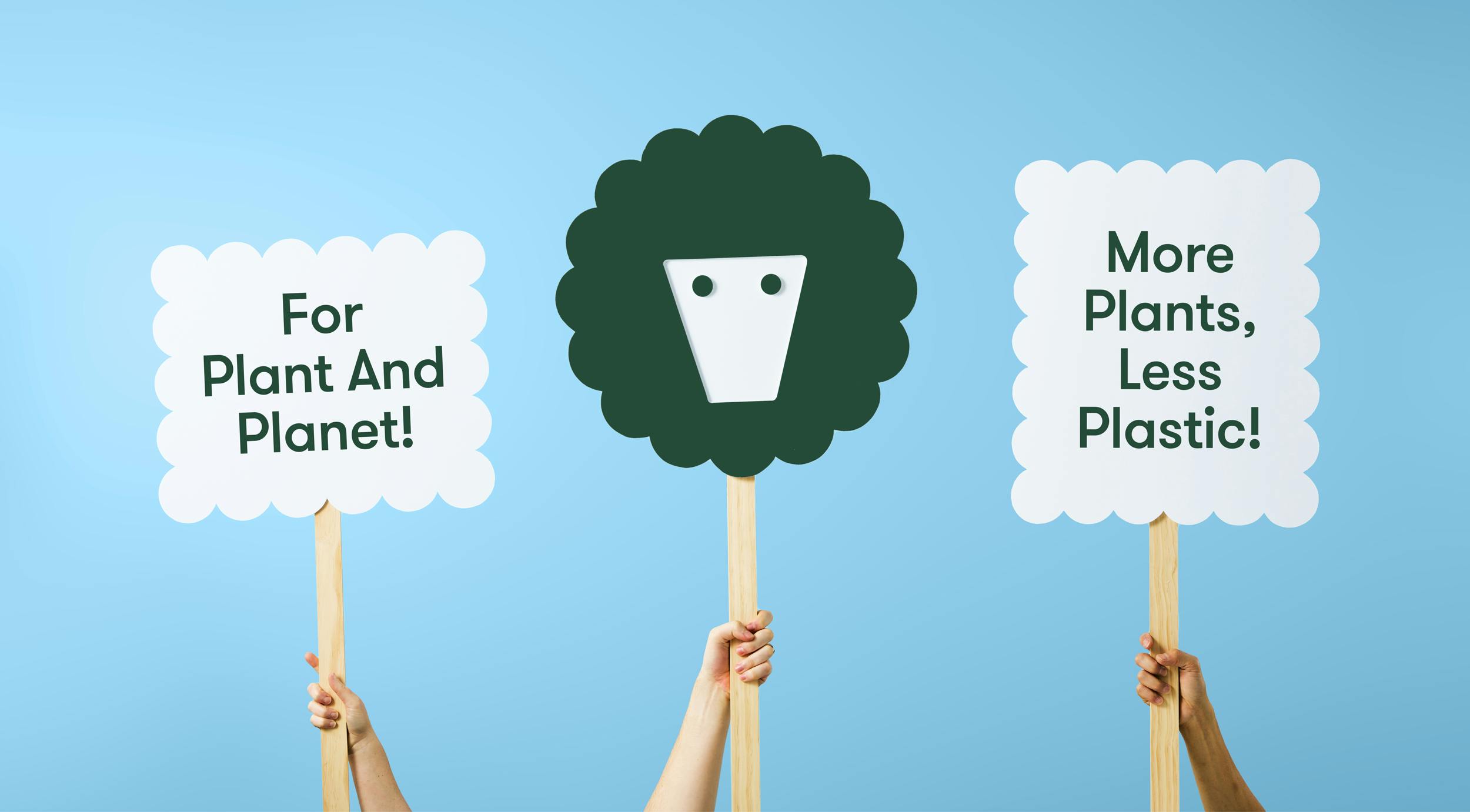
Designed by NZ agency Seachange, the face of the brand identity is a woolly sheep AND a flowery plant pot depending on whether you’re looking at the positive or negative space. It’s that type of smile-in-the-mind logo that makes you envious that you didn’t have the opportunity to think of it yourself.
This satisfying identity is extended through the use of woolly graphic shapes that frame imagery and messaging to give it an activist-y, campaign-y feeling that screams ‘purpose-driven brand’. There’s a sense of utility that comes through in the dialled down palette of green and a grey, but the white ink on kraft board print treatment keeps everything down-to-Earth. This is brought home by Grilli Type’s Walsheim - an inviting combination of humanistic and geometric that ties the identity together.
Overall, I think Seachange did an amazing job at re-imagining something usually mundane and innocuous into a delightful and sustainable product, and, by extension, lifestyle.
Alanna - Nurturing digital sustainability through user experience thinking
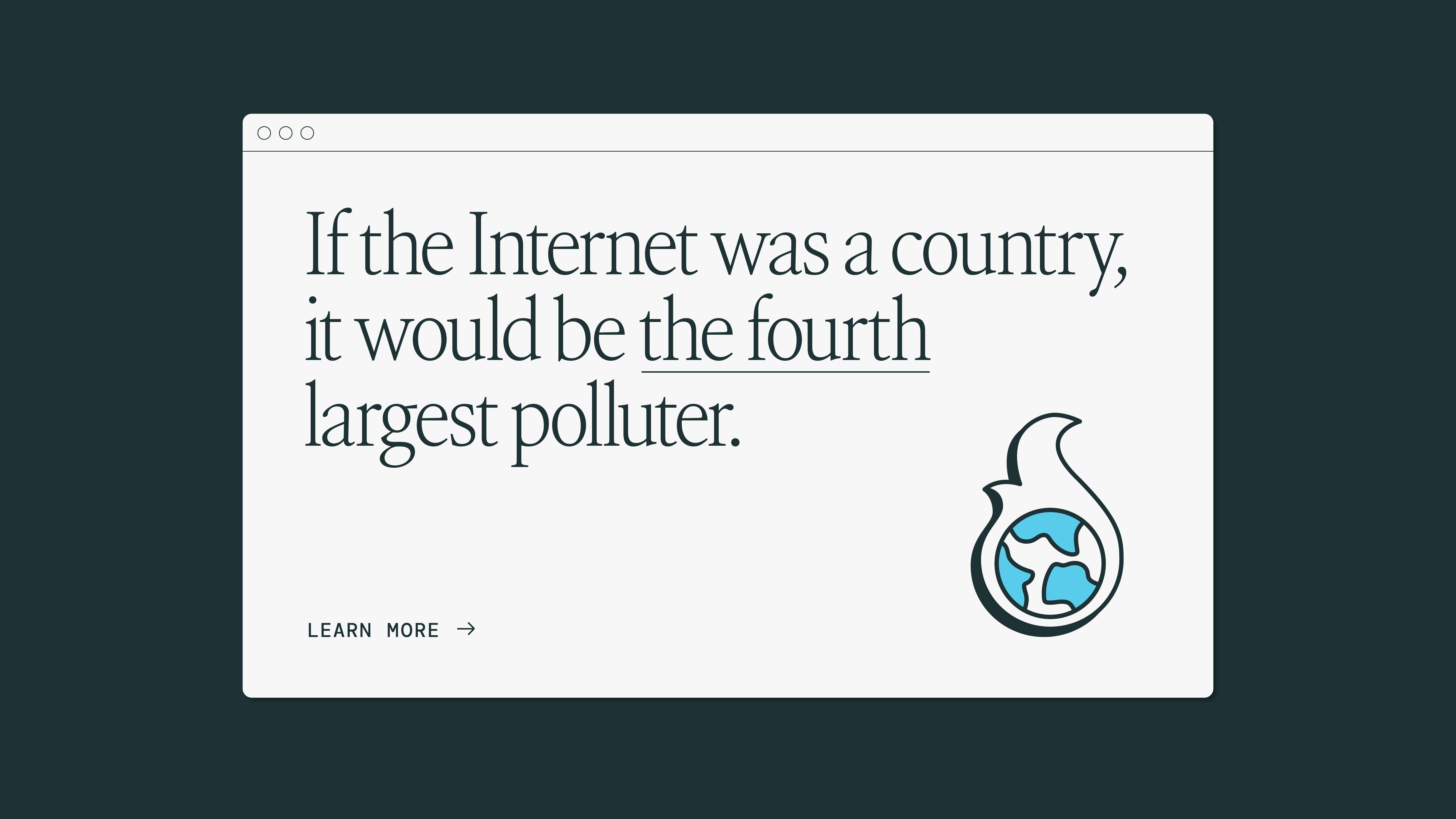
This month I was taken by a stat in the Sustainable Web Manifesto: “If the Internet was a country, it would be the 4th largest polluter.” In our digital age, where the internet seems intangible and eco-friendly by default, it's crucial to acknowledge the reality: every click, every scroll, equates to carbon emissions. While individually, our digital footprint may seem insignificant, collectively, it amounts to a staggering 3% of global greenhouse emissions.
In user experience thinking, we have the power to steer the digital landscape towards sustainability. Our choices in design and development can significantly impact not only carbon emissions but also factors like mental health and accessibility.
Embracing sustainable practices doesn't equate to sacrificing design or functionality. On the contrary, it's about optimising our processes to create a better web for everyone. From choosing hosting providers powered by renewable energy to streamlining code and compressing media files, there are myriad ways to lighten our digital footprint.
Moreover, integrating "Mother Nature" as a stakeholder in our user research phases is paramount. By prioritising sustainability alongside aesthetics and functionality, we can pave the way for a greener digital future. Websites like lowwwcarbon showcases numerous instances where sustainability and enhanced user experience harmonise seamlessly.
By embracing innovation and prioritising sustainability, we can create a more environmentally conscious and inclusive online world - if you’re curious about the performance of a website, the Website Carbon Calculator has been developed to do just that.
Stay tuned for more of what delights us from the world of sustainability creative next month.
Or if you were hoping for something a little more technical, head over to our insights page for the full range of thoughts, ideas and opinions from the brilliant minds at Edge Impact.
Explore previous editions of this series here:
From brand strategy to digital campaigns, we help organisations of all sizes embed sustainability into their brands, products and experiences authentically. If you’re interested in hearing more about how we help businesses navigate the complexities of sustainability through our creative approach, please get in touch.

