What does sustainability look like? - January 2024 Edition
Written by
Jordan Stokes, Caroline Leung, Alanna Roy Bentley, Jaymee Kim, and Alex Shute - Sustainability Transformation
We’re starting the year off with the first in an ongoing series of monthly articles from the Edge Impact creative team.
Each month we’ll take a look at some of our favourite purpose-led design, sustainable brands and impactful ideas from the world of sustainability creative, with our own thoughts on what makes it great.
This month we’ve been kicking 2024 off with some great circular economy projects and some really exciting digital exploration which has influenced what’s been appearing in our feeds and been guiding our own work.
All commentary and opinions are our own and come from Jord, Caz, Alanna, Jaymee, Alex and Alissa.
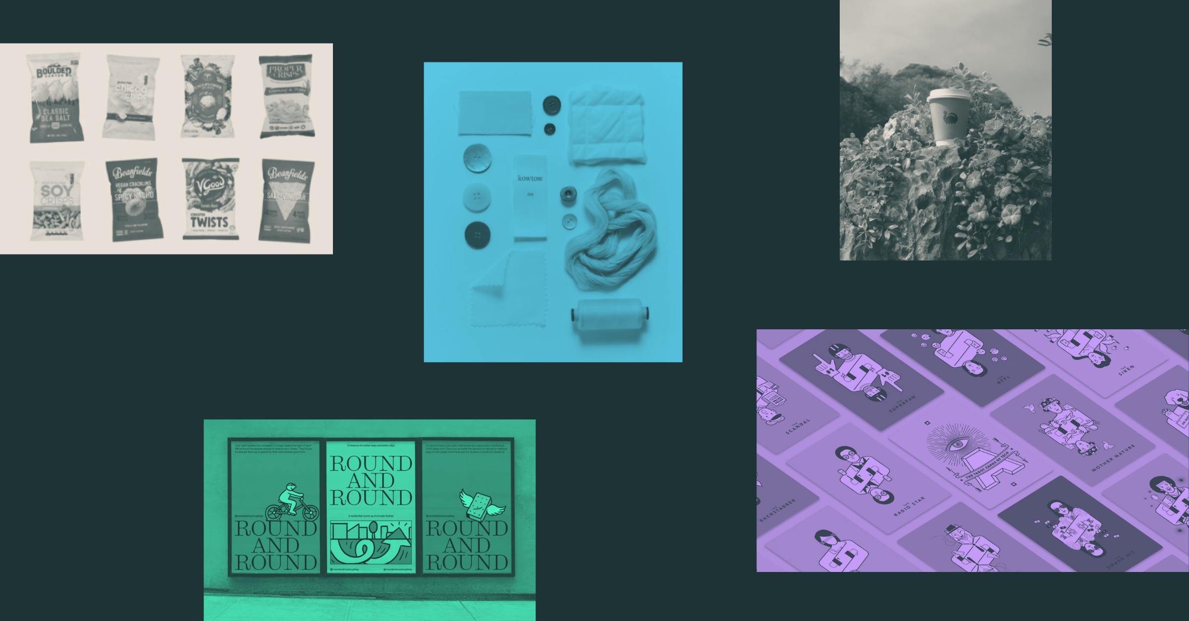
Alex - Round and Round

Designed by Accompany, Round and Round is Sydney’s newest digital sustainability hub, fostering knowledge and local connections that empower residents to embrace a circular way of life.
Focussed on combatting the alarming levels of consumption and waste in Australia, the platform addresses the urgent need for behavioural change by reshaping the iconic phrase that we all know well - into Reuse, Repair, and Rehome.
Under the three actions is an extensive list of tangible services and resources for Sydney-siders, all wrapped up into a vibrant, user-friendly website.
This dynamic ecosystem is presented through a playfully energetic brand identity defined by a harmonious colour palette, tongue-in-cheek messaging, and a stylish font system. The stars of the show, however, are the frame-by-frame animated illustrations that top and tail the site. With textured brush strokes and vintage half-tone fills, these bite-sized narratives are delightful additions to the brand.
Round and Round goes to show that advocating for a shift toward responsible choices and actions doesn’t have to be mundane. This little site truly has the potential to spark a social movement and create positive change in the way that Sydneysiders approach consumption and waste.
Jord - Kowtow

Kowtow are a Aotearoa based clothing brand with a true sustainability mission.
Since it’s inception, the brand’s focus has been on sustainable sourcing and fairtrade, organic cotton with it’s most recent communications detailing it’s commitments to being completely plastic free.
The application of the simple, stylish brand identity throughout the customer experience, combined with clear sustainability content is a shining example of how you can create beautiful design, art direction and tone of voice that is able to support more detailed, technical information.
I love the way that the brand has opted out of a separate ‘sustainability’ section of their website in favour of bringing responsibility and their hero ‘plastic free’ initiative up to the same level as their products.
The level of detailed content that exists within the site to explain their certifications, their manufacturing processes, circular principals and the steps they take to live and breathe sustainability is amazing. This content is not just expansive, but has been beautifully crafted into engaging messaging, infographics and editorial.
The list of things I think this brand does brilliantly could go on and on, from the styling and inclusive imagery, their repair scheme, their latest impact report (chef’s kiss), the detailed materials and certifications listing on each product and obviously just the way it’s all so elegantly put together.
But, it’s their most recent social imagery that I’m currently all over. Having been involved in a lot of Lifecycle Analysis, EPD and transparency projects recently. I love the way the brand is starting to communicate it’s LCA data, it’s materials, their certifications and supply chain in a really clean and effortlessly beautiful way.
It takes a whole lot of hard work to make something that simple.
Alanna - Tarot Cards of Tech

The Tarot Cards of Tech by Artefact Group are “a set of provocations designed to help creators more fully consider the impact of technology” and an excellent of example of imaginative sustainability communication.
It features questions like “If the environment was your client, how would your product change?” and “What happens when 100 million people use your product?” or “When you picture your user base, who is excluded?”
This is a great example of how asking the right questions is just as important (if not more) as finding the right answers when it comes to sustainability.
Despite being aimed at a tech/product producing audience the questions are broad enough that they could also be applied to a business. It tackles issues of accessibility, cultural bias, resourcing, market monopolising, behaviour change…. All through the medium of tarot, a widely known (and loved) fortune telling card game.
The thought provoking and well written questions paired with the game-like interface of the cards, stylised illustrations, and considered detail through motion interactions all work together to make it a thought provoking experience that leaves you feeling inspired by the opportunities to make a difference rather than overwhelmed with issues.
Last year, Edge Impact’s Transformation Toolkit used a similar approach to help businesses and organisations imagine what sustainability leadership looks like for them by Sustainability Leadership Archetypes, you can read more about it here.
Creating memorable, accessible and playful approaches as introductions to serious topics is a valuable opportunity to grow awareness and get more people talking about issues of Climate Change that otherwise are difficult to find a way into. Tarot Cards of Tech has done a great job of this, I’ve shared this with all my friends, tech-y or not!
Jaymee - Wholesome

‘Wholesome’ is a grocery delivery service that stocks planet friendly products, making it an accessible and cost effective way for people to live mindfully and do good by the planet, starting from the active choices made in the products we use to sustain our everyday.
Living sustainably should be accessible to all people, and doing good by the planet shouldn’t be constrained by our economic status.
Universal Favourite hits the nail on the head with the branding for ‘Wholesome’. Paving the way to speak transparently and have sustainability at the forefront without it being boring and expected.
The brand has energy and an inviting presence that is able to engage and resonate with their audience. The visualisations, bespoke icons and tone of voice break down in a straight forward and understandable way their values and vision.
Design in sustainability often has the misconception of complexity, but this branding only shows when approaching the task with mindfulness of the people and the core ideas that need to be communicated, that it doesn’t have to be a stock standard brand. But it can be something that maintains unique character, mission and impactful presence in the world without compromise.
Caz - De-extinction

To my delight, I stumbled across a vibrant, fresh and charismatic sustainability brand identity for De-extinction by Koto. De-extinction is a sustainable packaging company, bringing life and personality to an area that can be typically formulaic with heaps of doom and gloom. With it’s unique design style, cute illustrations and lively tone of voice, it ticks all the boxes for what makes a brand great (in my opinion).
It definitely makes an impact by getting our attention and highlighting the plastic problem in food and hospitality and pushing against the status quo of dull, dry sustainability branding. But I think what's missing is the technical and evidence-based data to give this brand's communication true credibility.
When thinking about sustainability in the space of design and brand, it’s our responsibility to not only capture our audience and bring awareness to important planetary issues but also cut through the complexity to call out exactly what makes a product sustainable or eco-friendly. What I’d like to see is more of the how and why: more transparency, more data to support a brands ethos and the certifications to prove exactly how this brand could change the disposable packaged goods space for the better.
Stay tuned for more of what delights us from the world of sustainability creative next month.
Or if you were hoping for something a little more technical, head over to our insights page for the full range of thoughts, ideas and opinions from the brilliant minds at Edge Impact.
Explore previous editions of this series here:
From brand strategy to digital campaigns, we help organisations of all sizes embed sustainability into their brands, products and experiences authentically. If you’re interested in hearing more about how we help businesses navigate the complexities of sustainability through our creative approach, please get in touch.


